
Cards correspond to tabs (screens) on the user’s mobile device.
By using a series of cards it is possible to spread the data within a single Message across multiple tabs (screens), with relevant sets of data items to be grouped and captured together.
Every template needs to have one card identified as the root card. This card becomes the first tab (screen) that is displayed on the device when creating or viewing a message.
A Template can include multiple Cards, so it is good practice to spread data items across a number of cards, and to group data items into logical groups (for example, a property assessment form may contain a Root Form for the overall property and lease information, along with a Form for each room type. Cards can be linked together using using a “Link Command”.
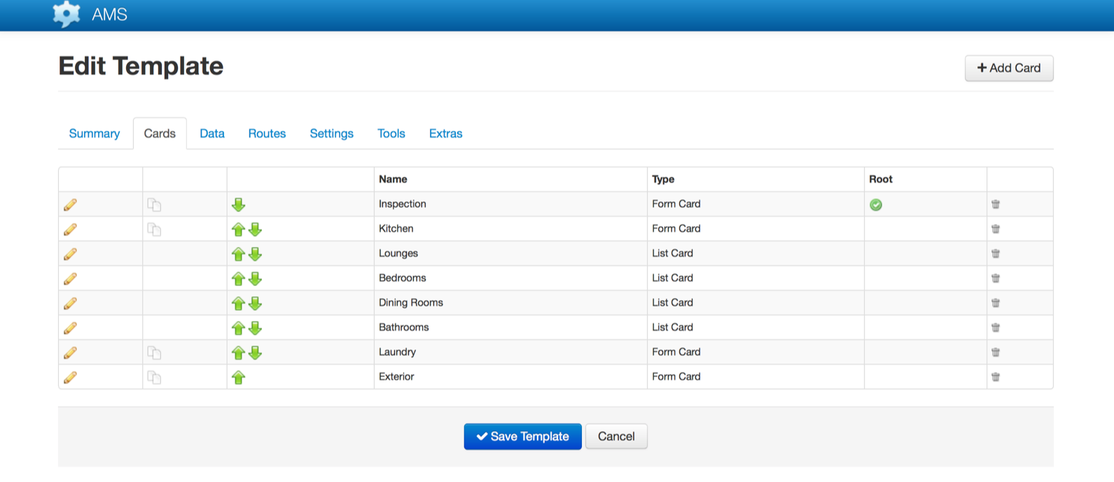
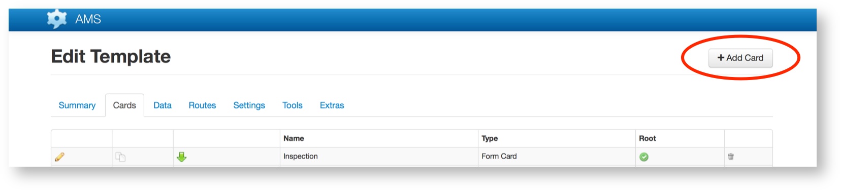
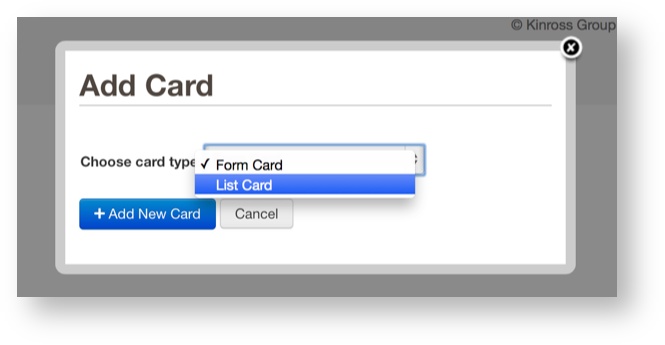
There are two types of cards, Form Cards and List Cards. To add a new Card, click the “+ Add Card” button in the top right of the screen:
Then select the Card type to be created (Form Card or List Card).
Card Types
Form Cards
Form Cards contain fields and commands. Any number of fields and command items can be added to a Form, however it is best to keep the number relatively low in order to improve usability and performance on the device. A single Form Card should contain data items that are logically grouped together.
List Cards
List Cards can contain multiple entries of a sub template. They can be used as root cards or contained within a template and linked to from a form card. If you were creating a roster type form you could use a list view for each of the roster entries rather than sending multiple messages. To use a List Card you need to select a non root Template for the type of entries that will be displayed. You will also need to specify an external label as List Cards are considered data items that contain a collection of entries.
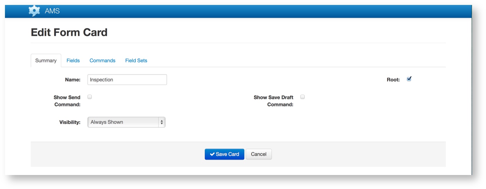
Summary Tab
The Summary Tab provides general information about the Card, whether a Form or List Card
| Field | Description |
|---|---|
| Name | The Name of the Card as it will appear on the device. This will become the Tab title. |
| Root | Each Template must have one (and only one) Root Card. The Root Card is the first Card displayed when a Message is opened. |
| Show Send Command | If this is checked then a “Send” button will be visible on the device and the user will be able to tap the button to send the Message. |
| Show Save Draft Command | If this is checked then a “Save Draft” button will be visible on the device and the user will be able to tap the button to save a draft version of the Message. |
| Visibility | The Visibility attribute allows control over when a Card will be shown to the user on their device. |
Fields Tab
Fields are used to define the data items and associated rules for the Card. The Fields tab shows a list of the Fields on the current Card:
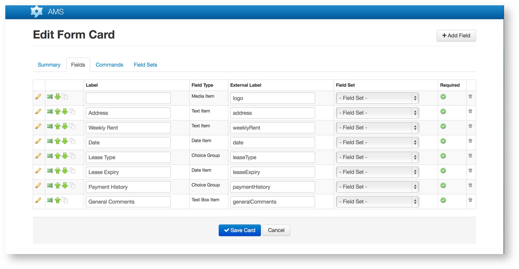
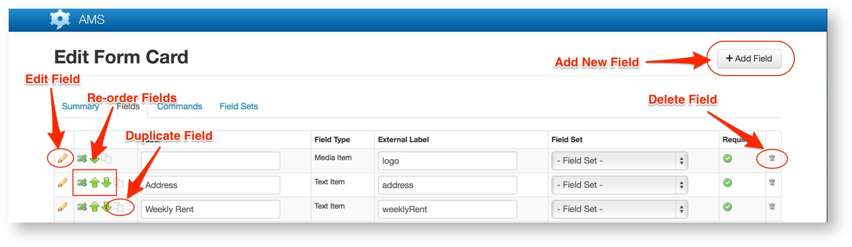
The Field list on the Fields tab allows you to add a new field, edit an existing field, re-order the existing fields, duplicate an existing field and delete an existing field:
Add Field
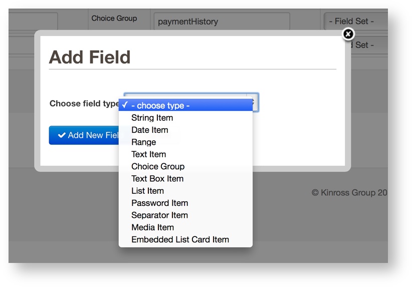
To add a new Field, click the “+ Add Field” button in the top right of the screen.
Select the type of Field to be added from the dialog box:
A new Field with no name will be appended to the end of the existing Field list. Click the pencil icon in the left-most column to edit the Field.
Field Types are as follows:
| Item | Description |
|---|---|
| String Item | A non editable string. Can be used for providing instructions or extra information. |
| Date Item | A Date Item captures either a date, or a date and time combined. Transsend will use the device’s native UI controls to render the date and time picker controls on each device. |
| Range Item | A Range Item presents the user with the option to select a single number from a range of values. The values start at 0 and end at the maximum value set in the field definition. The increment size is 1 and the default (initial) value is defined in the field settings. |
| Text Item | A Text Item presents the user with a single line editable field into which they can type free format text. Other types of text fields include the Text Box Item and the Password Item. |
| Choice Group Item | A Choice Group Item allows a user to select from a range of fixed options. There are several styles for the Choice Group fields, including menu, radio button, switches and checkboxes. The selected style will determine attributes of the style, for example whether the user can select one only, or multiple, items from the group. |
| Text Box Item | A Text Box Item presents the user with a multi-line editable field into which they can type free format text. Other types of text fields include the Text Item and the Password Item. |
| List Item | A List Item allows the user to select an item from an Transsend List. |
| Password Item | A Password Item presents the user with a single line editable field into which they can type free format text. Other types of text fields include the Text and Text Box Items. |
| Separator Item | A Separator field is a purely visual element which places a horizontal line on the screen. It can optionally have a title, and is useful for separating sections of fields on a screen (within a tab). |
| Media Item | A Media field allows the card to capture special media from the device, including photos and handwriting (e.g. signatures). |
| Embedded List Card Item | Places the contents of a list card into the current form card. Number of items is fixed currently. |
Ordering Fields
Fields can be ordered by using the green arrows to move them up or down.
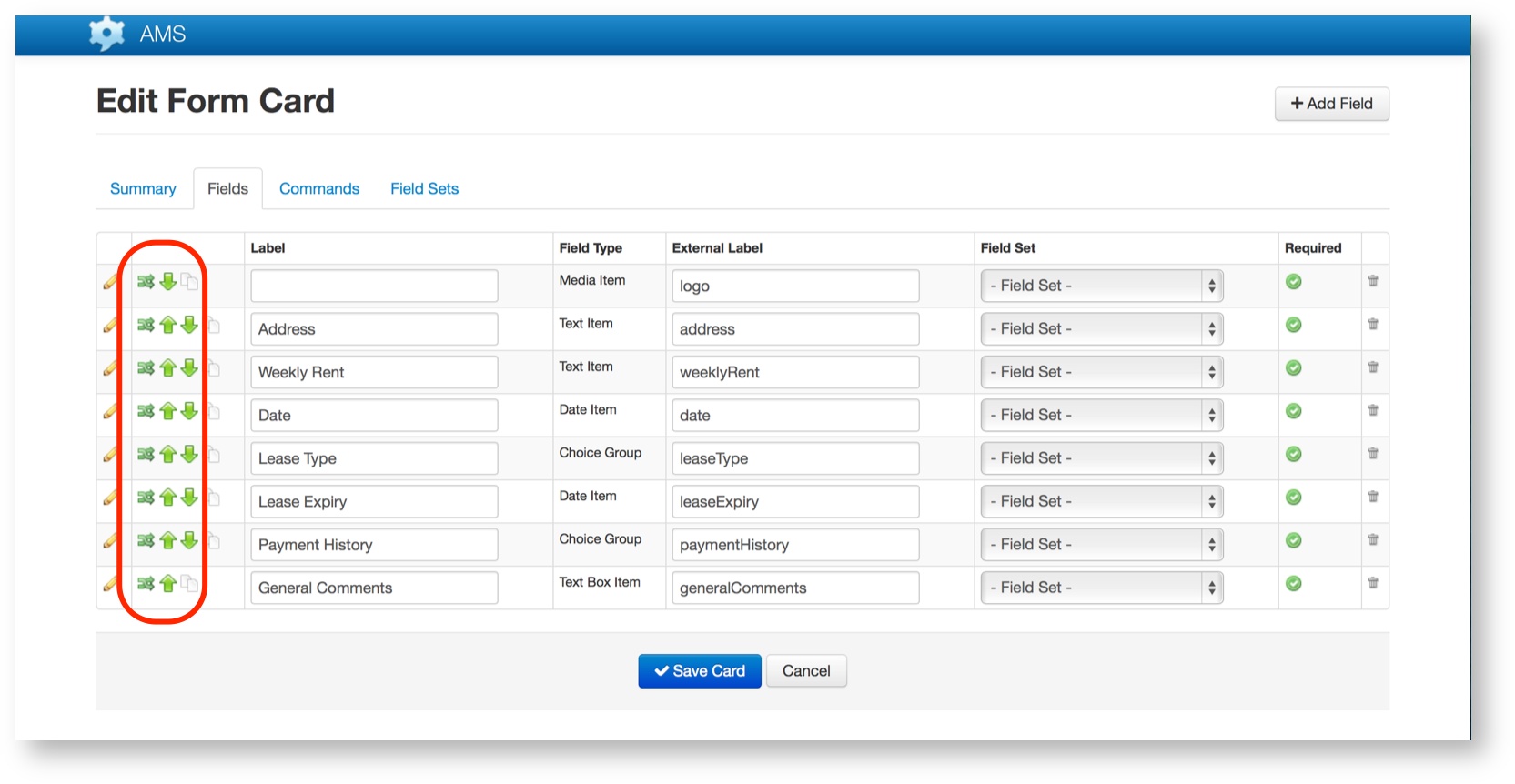
Clicking the shuffle button (the left-most button) will bring up a list of fields and allow selection of where to move the card, to the top,bottom, before or after a specific field to even to another card:
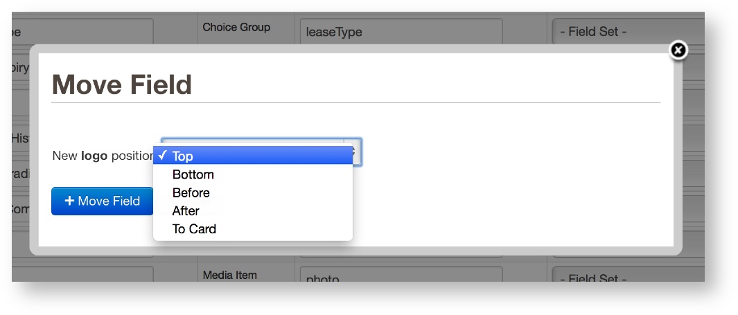
Clicking the up and down buttons (as available) will simply move the field up or down one position at a time.
Commands Tab
Commands are used on Cards to provide menu choices for the screen on the phone. The following is a list of types of commands available.
| Command | Description |
|---|---|
| Link | Link commands connect two cards together. |
| Text Box Command | A text box command links a form card to a text box contained in that card. |
| Call Command | Uses a meta data entry to place a phone call. This can be useful as a short cut to call a phone number without requiring the user to enter a phone number e.g. a call command could be set to automatically call the client for a particular job. |
| Set Value Command | This command can be used to set a meta data entry to a predetermined value. This could be used as an “Accept” or “Reject” command. |
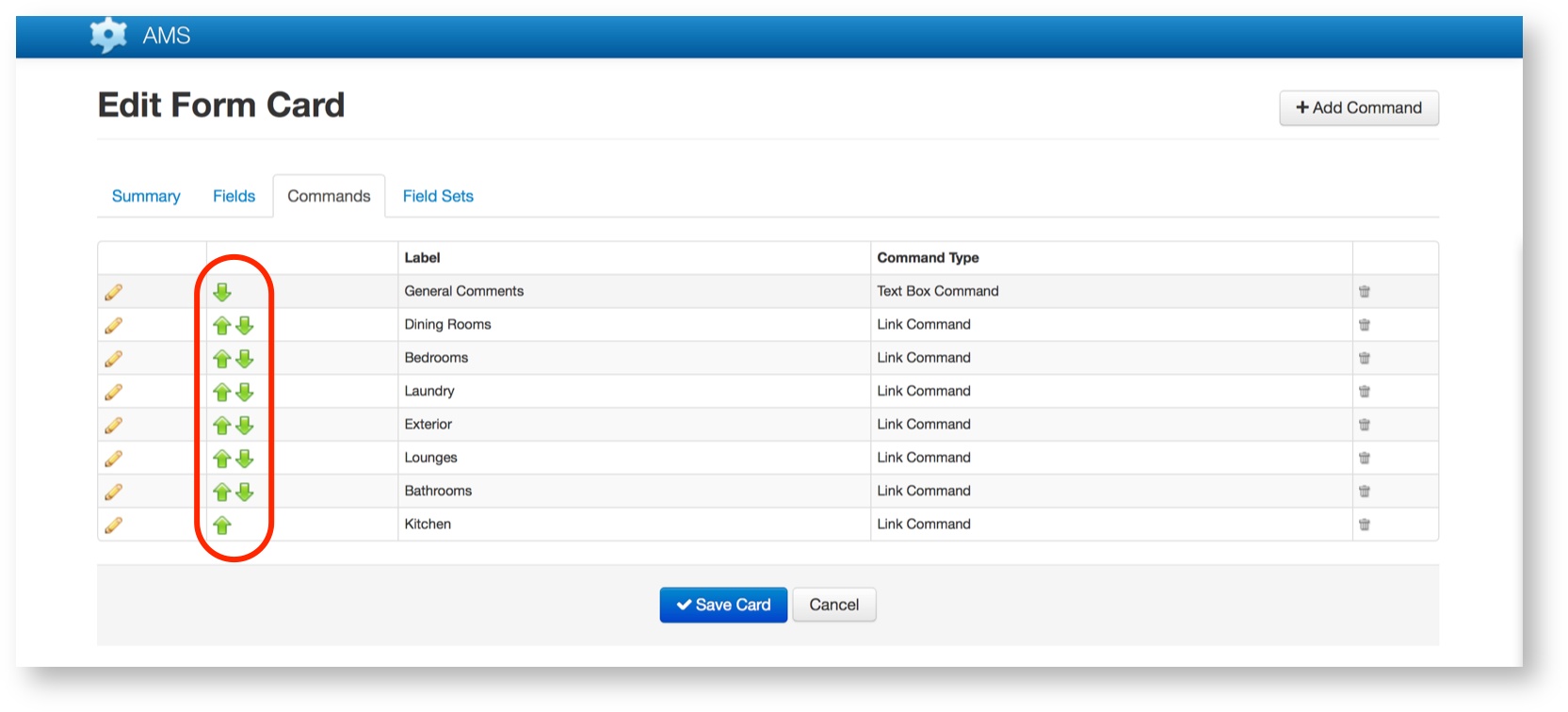
Ordering Commands
Commands can be ordered by using the green arrows to move them up or down.
Field Set
Field sets allow you to apply Visibility Rules to a set of fields, rather than repeating for each one.